Onboarding project | BluSmart
About the company: BluSmart is India's first all-electric ride-hailing platform with 1.8 million+ riders across three Indian cities — Bengaluru, Delhi, and Mumbai, and Dubai.
| Product | BluSmart |
|---|---|
Value Proposition | BluSmart offers 100% electric cab rides and rentals with zero cancellations that are clean, punctual, and driven by true professionals. |
Target Market | Urban residents, including professionals, families, and entrepreneurs in Tier 1 cities, who prioritise clean, on-time, and hassle-free urban commutes. |
Criteria | User 1 | User 2 |
|---|---|---|
Name | Anchit | Kapila |
|
| |
Age | 27-35 years | 35-45 years |
Income | ₹80,000-1.5 lakh/month | ₹2 lakh+/month |
Location | Bengaluru | Delhi/ Gurugram |
Gender | Any gender | Any gender |
Kids | No | Yes, 2 |
Marital status | Unmarried | Married |
Education level | Bachelor's degree | Master's degree/ MBA |
Lives with? | Roommates | Family |
Tech expertise | High | High |
Occupation | Entry-mid level professionals, entrepreneurs | Mid- to senior-level professionals |
Most used apps | Social Media, Netflix, Zomato, Swiggy, Blinkit, Zepto | Banking apps, LinkedIn, Zepto, Blinkit, Facebook |
How do they spend their time outside of the office? | Clubbing, OTT, shopping online, local events | With family, conferences, business travel |
What kind of contenrt do they consume? | Doomscrolling on social media, educational content, pop culture, sports, fast fashion | News, stock market, sports |
Where do they spend their money? | Commute, rent, groceries, clubbing, eating out, OTT subscriptions, the latest consumer electronics | Mutual funds, children’s education and healthcare, family travel, cultural events |
Other cab and auto-hailing apps used | Ola, Uber, Namma Yatri, Rapido | Uber |
Owns a vehicle? | Yes, two wheeler | Yes, four wheeler |
Need | Need a reliable cab to commute to office, social events on weekends, and airport. | Need a clean, reliable cab with a professional driver for business and family travel or airport rides. |
Pain Point | Unavailability of cabs in Bengaluru, high cancellation rates from other cab services | Other cab services offer rundown cabs with often unprofessional drivers who haggle and call too many times |
Goal | Book a ride with transparent pricing without dealing with cancellations or delays. | Book a ride that offers safe, premium, and professional travel for business and family with no hassle. |
Behaviour | Books BluSmart for:
| Books BluSmart for:
|
Willingness to pay | Low-medium | High |
Amount of money spent on BluSmart per week | ₹1000-1200/week | ₹2000/week |
Perceived Value of Brand | Medium | High |
Features most used on BluSmart |
|
|
Frequency of use case | 3-4/week | 2-3/week |
Goals | Functional | Functional |
Value Accessibility to product | Medium-high | High |
Value Experience of the product | Medium-High | High |
Goal Priority | Goal Type | ICP | JTBD | Validation approach | Validation |
Primary | Functional | ICP 1- Anchit | Creating a cab-hailing experience that is reliable and has zero cancellations. | User interviews | "When I'm commuting within the city or to the airport, I want to book a reliable cab without worrying about cancellations, so I can get to my destination on time and without hassle." |
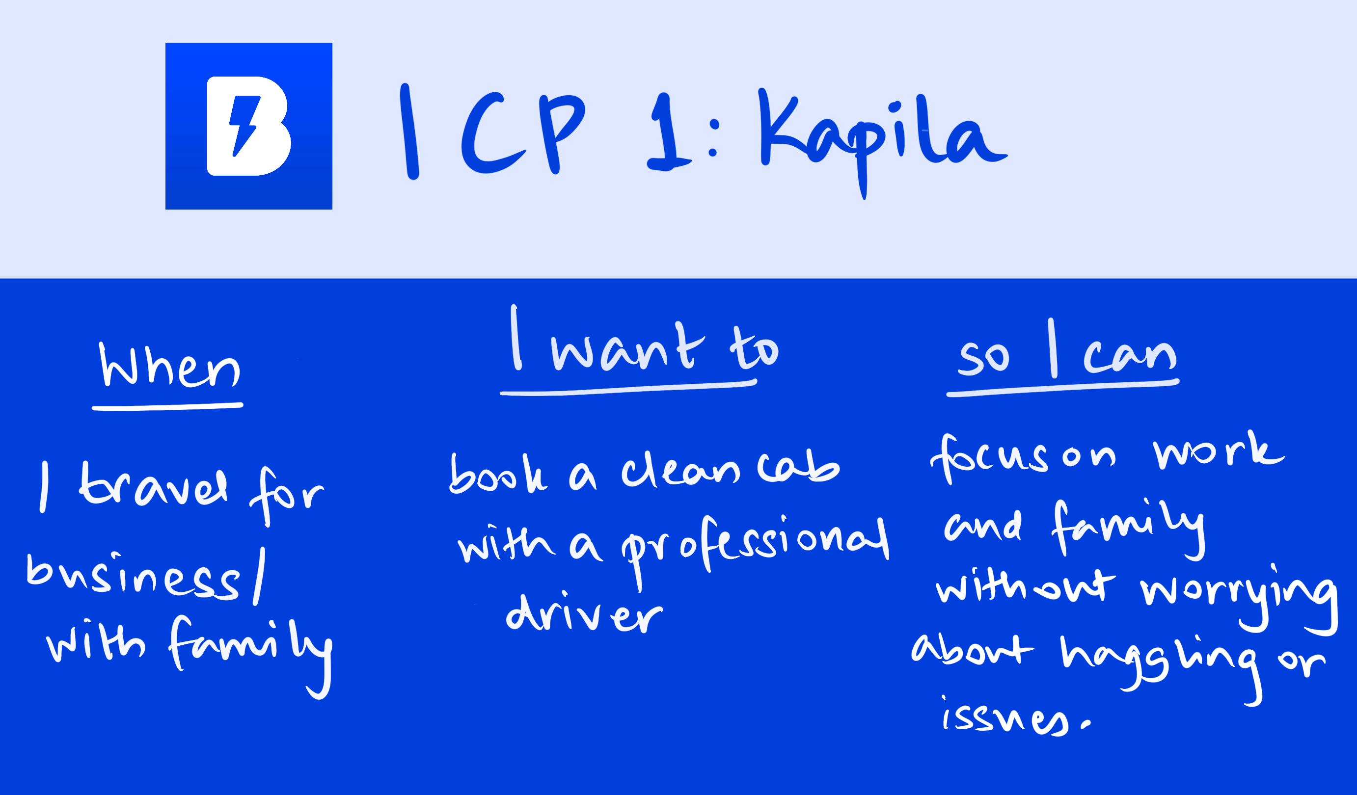
Primary | Functional | ICP 2- Kapila | Create a cab-hailing service that offers clean, well-maintained cabs with a premium feel, driven by a professional and polite driver. | User interviews | "When I'm travelling for business or with family, I want to book a clean cab with a professional driver, so I can focus on my work and family without worrying about haggling or issues with the cab." |
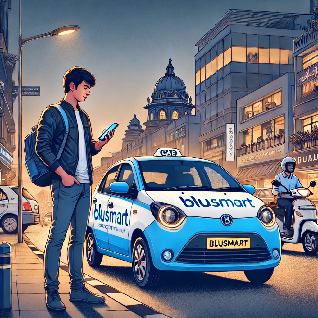
ICP 1: Anchit
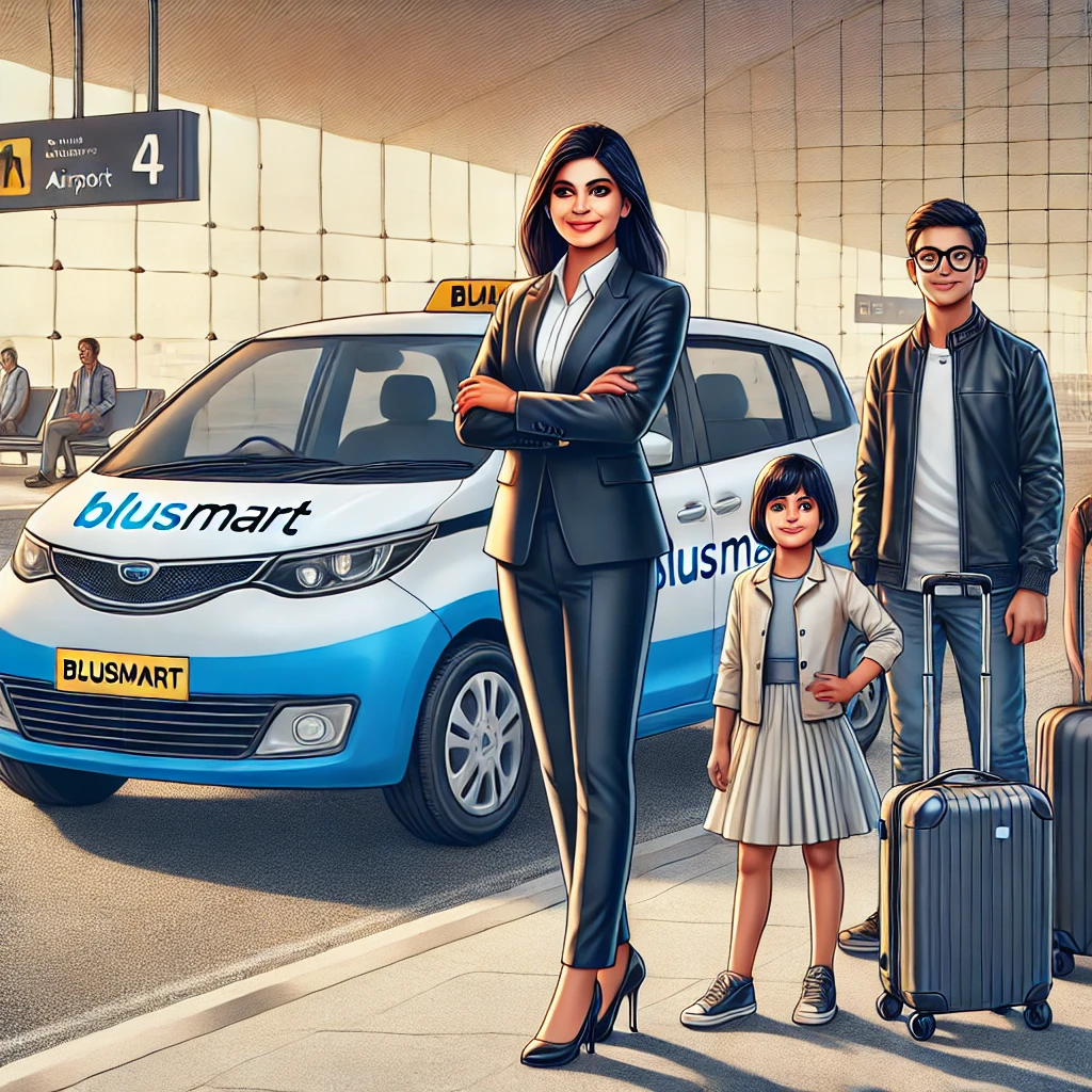
ICP 2: Kapila
How to do an onboarding teardown?
Take screenshots of each page of the interface, note each interaction and user touchpoint, and assess based on user empathy:
- What is working well on the screen and why?
- What is not working and why?
- What changes/improvements do you suggest can be made? Why do you think that would be better?
- Where does the “aha” moment occur?
- Evaluate your onboarding on the cognitive biases.
🔎 The Search
- Google Search
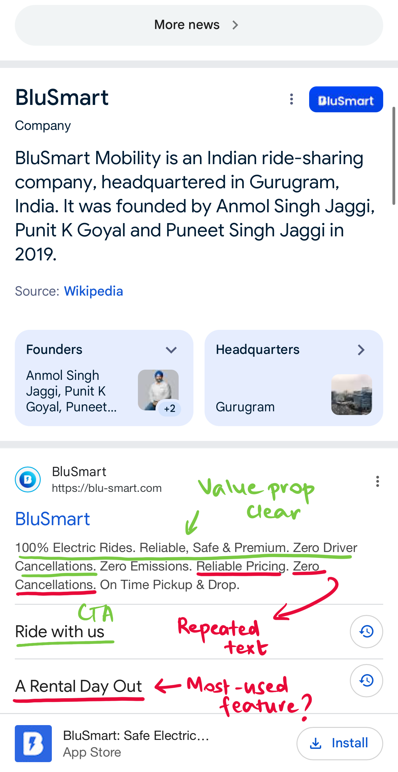
What's working?
✅ Value prop clearly stated, addressing pain points.
✅ Clear CTA: "Ride with us".
✅ Install button leads to app store seamlessly.
What's not working?
❌ City names serviced not mentioned, which is key information.
❌ "Reliable" and "Zero Cancellations" repeated twice, could have been replaced with other key information or value props like "Clean" or "Hygienic".
❌ "A rental day out" is wasted real estate, considering most urban commuters will book city rides from point A to point B/ for airport rides.
Suggestions
💡Replace "A rental day out" with "Book your airport ride" or "Book your city ride".
💡 Optimise description without repeating words and adding city names.
- App Store Search Page
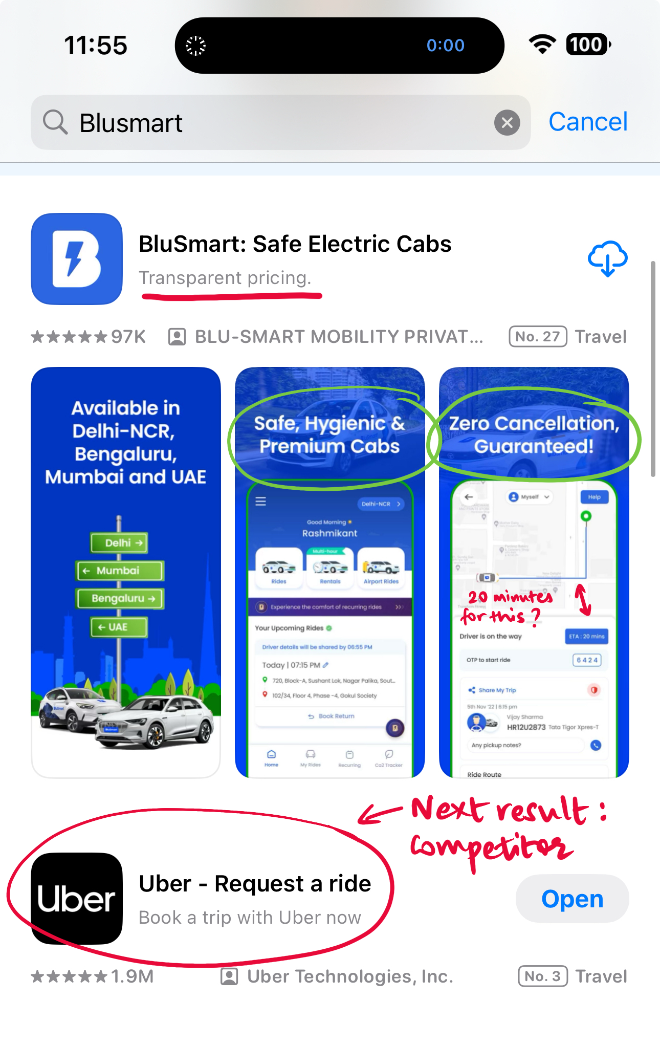
What's working?
✅ Consistent branding with the recognisable blue and white colours.
✅ Key information clearly visible: Locations, value prop, zero cancellations guarantee.
What's not working?
❌ The next search result is a competitor's, more reason to optimise description.
❌ Third image shows a ride a short distance away with an ETA of 20 minutes.
Suggestions
💡Replace "Transparent pricing" with "Book a hassle-free cab now" or something that distinguishes BluSmart from Uber and other cab-hailing services.
- App Store App Page
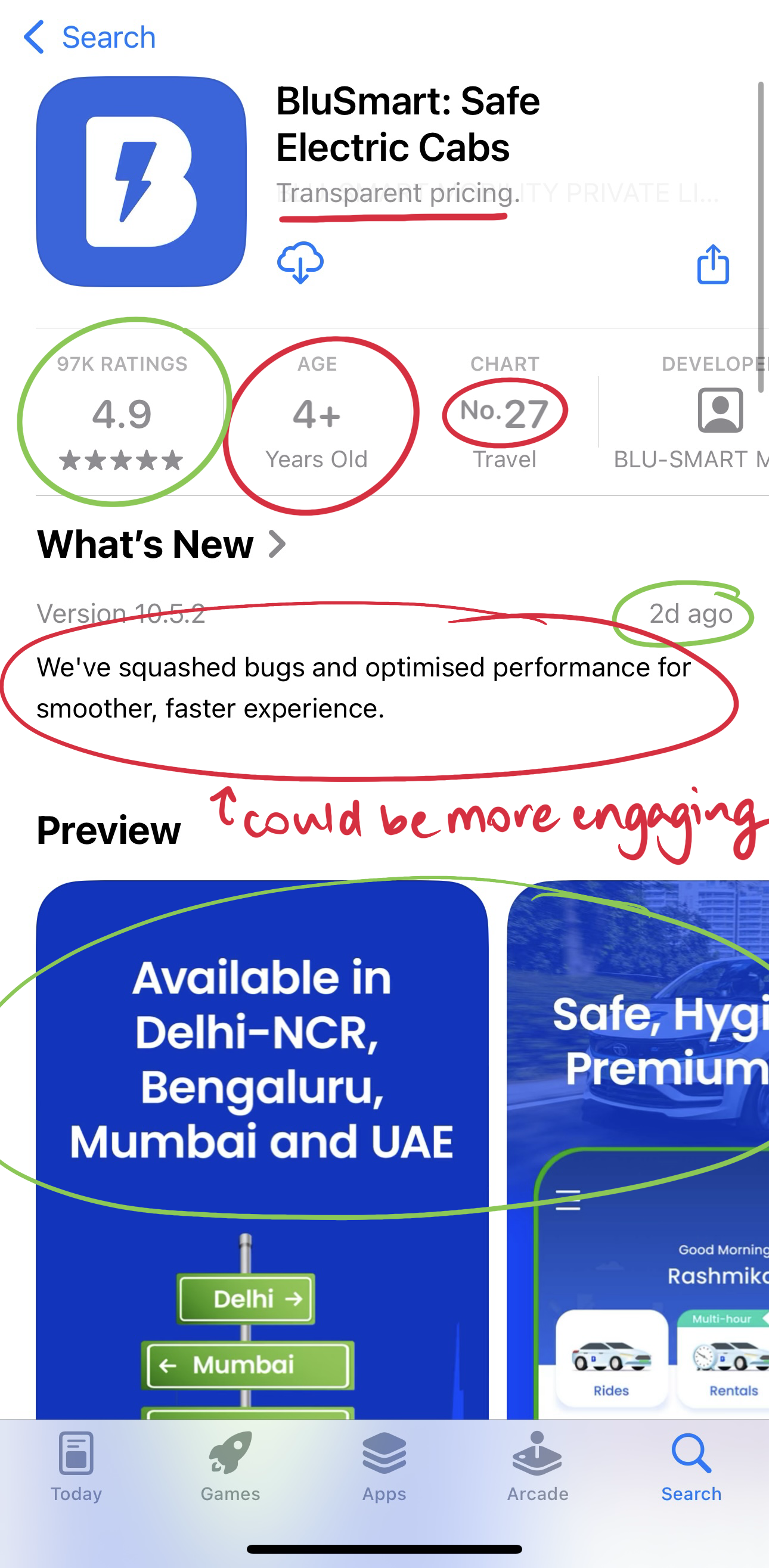
What's working?
✅ 4.9 rating builds credibility
✅ Latest app update being two days old helps assure users that bugs are being fixed and regular updates are being released.
✅ Consistent branding with the recognisable blue and white colours.
What's not working?
❌ The next search result is a competitor's, more reason to optimise description.
❌ The app update description could be made more playful or fun.
❌ Age rating being 4+ years doesn't make sense, considering children do not book cabs on their own.
❌ No.27 ranking on the app chart in the travel category could be discouraging, efforts to improve this rating needed.
Suggestions
💡Create engaging app version update copies that build community and entertain. For example "Gear up for a smoother, faster, experience, because we've forced those bugs to hit the road."
💡Work on improving ranking in the App Store.
⬇️ The First Use
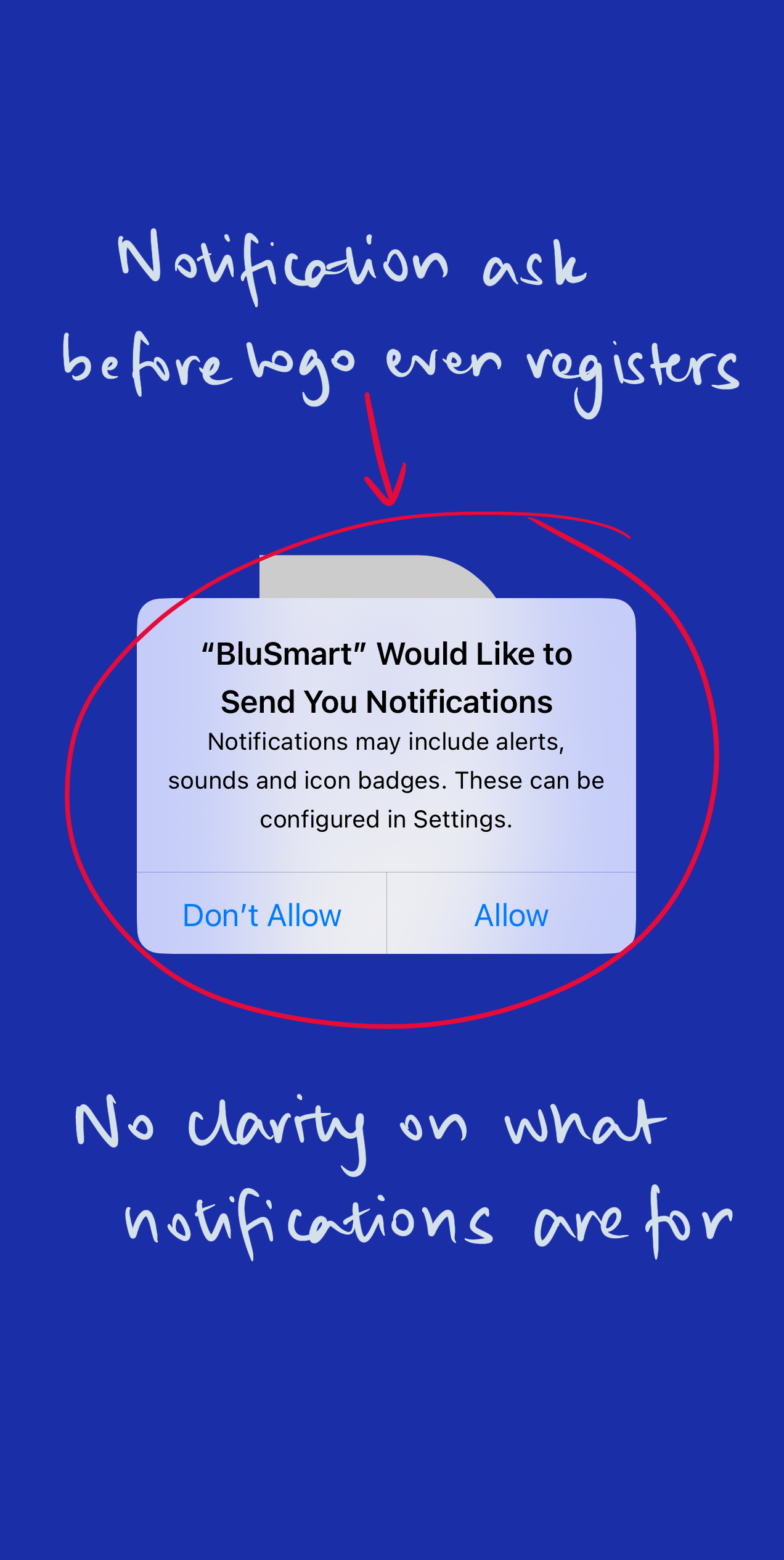
What's working?
✅ Start of progressive disclosure method for permissions, which makes process simpler
✅ Simple and minimalist on-brand screen
What's not working?
❌ Ask to turn notifications on comes too soon, without the information of why these notifications are being turned on.
❌ Ask to turn notifications on comes before there's enough time to register the company's logo.
Suggestions
💡Inform users of the steps and what they are for before asking for permissions.
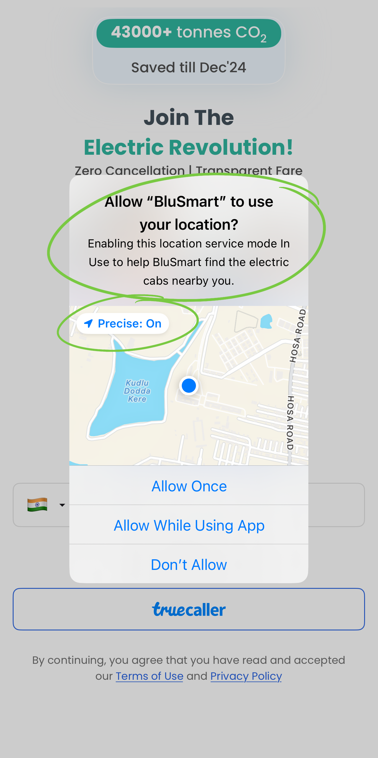
What's working?
✅ Information on why BluSmart wants to use my location
✅ Preselection of "Precise" location makes sense in this use case and reduces a step
What's not working?
Suggestions
💡Background can be consistent with previous screen
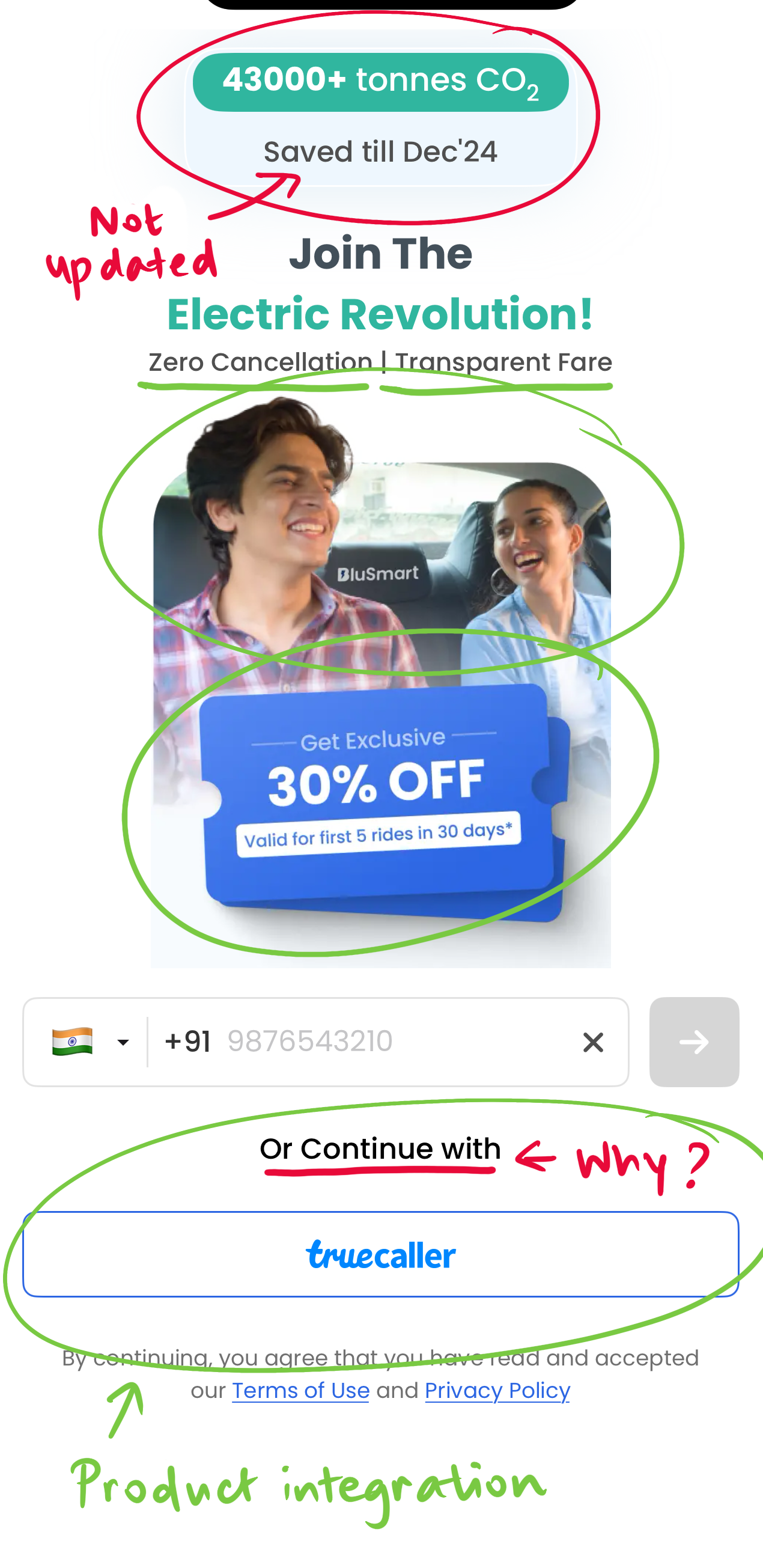
What's working?
✅ Faces of happy customers creates an assurance of good experience.
✅ Offer of "Exclusive 30% off in the first 5 rides in 30 days" is nudging action towards an activation metric.
✅ Product integration with Truecaller gives user another option and makes sign-up seamless.
✅ "Zero cancellation" and "Transparent fare" is consistent messaging in line with what users have previously read.
✅ Noble Edge Effect in use with "43,000+ tonnes CO2 saved".
What's not working?
❌ 43,000+ tonnes CO2 saved till December 2024 is now an outdated number, considering it is March end already.
❌ No information about why a user should continue with Truecaller, what is the benefit?
Suggestions
💡Inform users of the value of continuing with Truecaller.
💡Adding a number about how many customers BluSmart has would make more sense on the top to evoke the Bandwagon Effect or effects of social proof, instead of how many tonnes of CO2 saved.
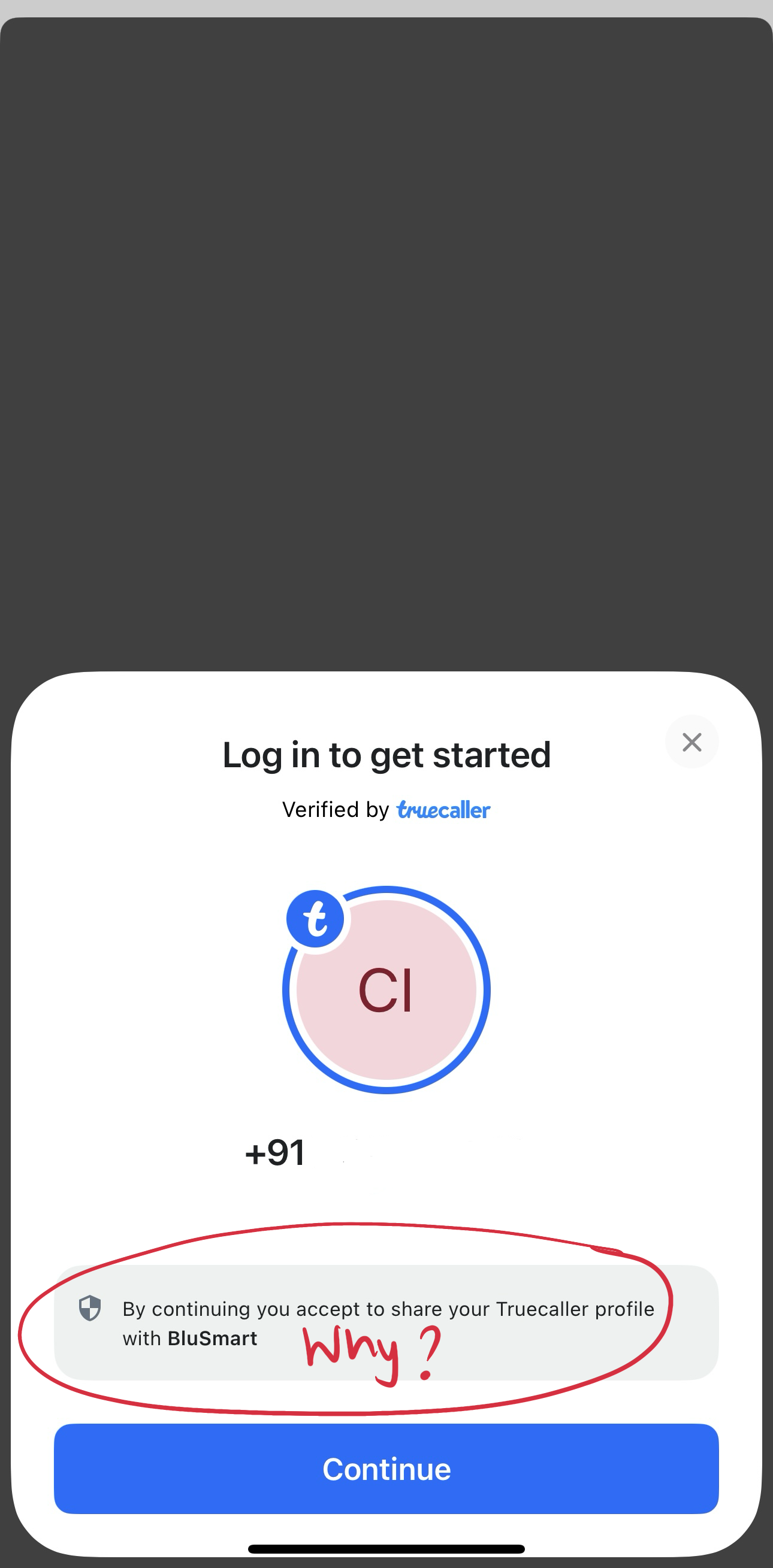
What's working?
✅ Clicking "Continue with Truecaller" opens this screen, seamless integration.
What's not working?
❌ No information on why a user should continue with Truecaller, what the benefits are.
Suggestions
💡Inform users of the value of continuing with Truecaller.
⬇️ Creating an account
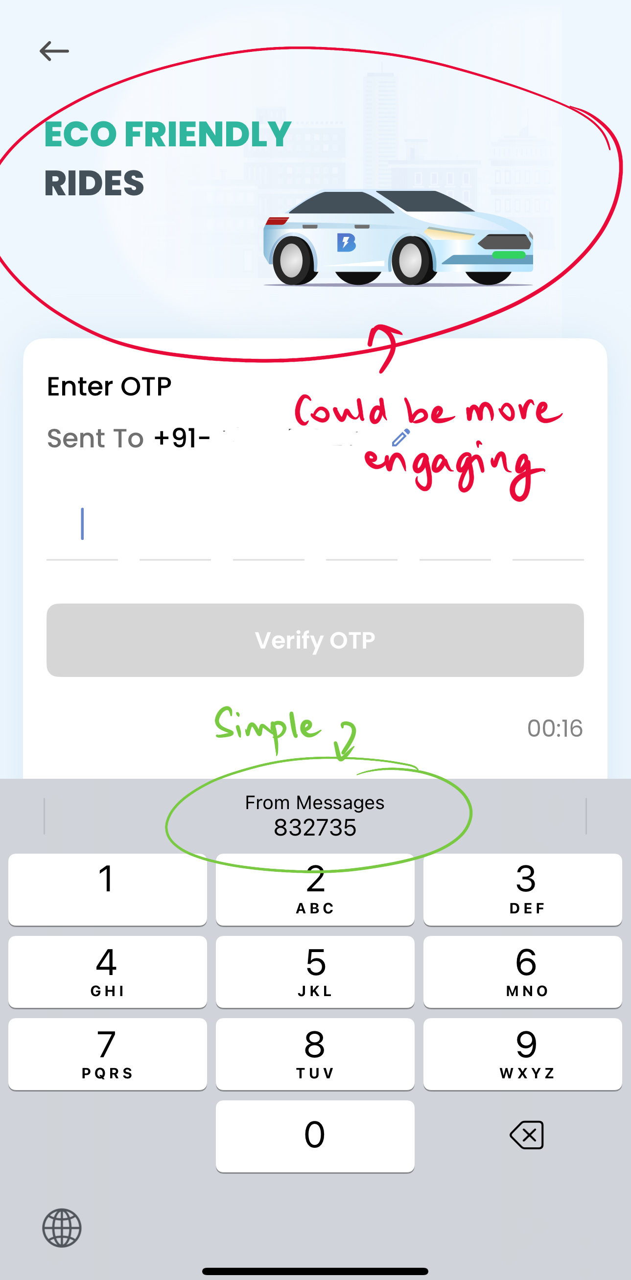
What's working?
✅ Simple OTP signup, progressive disclosure for sign-up begins.
What's not working?
❌ Branding colours inconsistent in graphics on the top half, space could be used better.
❌ Typo: Eco-friendly needs to be hyphenated.
❌ Core value props users look for like "Clean", "On-time", or "Hassle-free" could be used here instead of "eco-friendly".
Suggestions
💡Add more visually appealing and engaging elements in the top half, could be an animation of a BluSmart cab in motion, showcasing a value prop. In this case, how many CO2 saved. Picture Superiority Effect and Storytelling Effect can be used to tell a user's journey story.
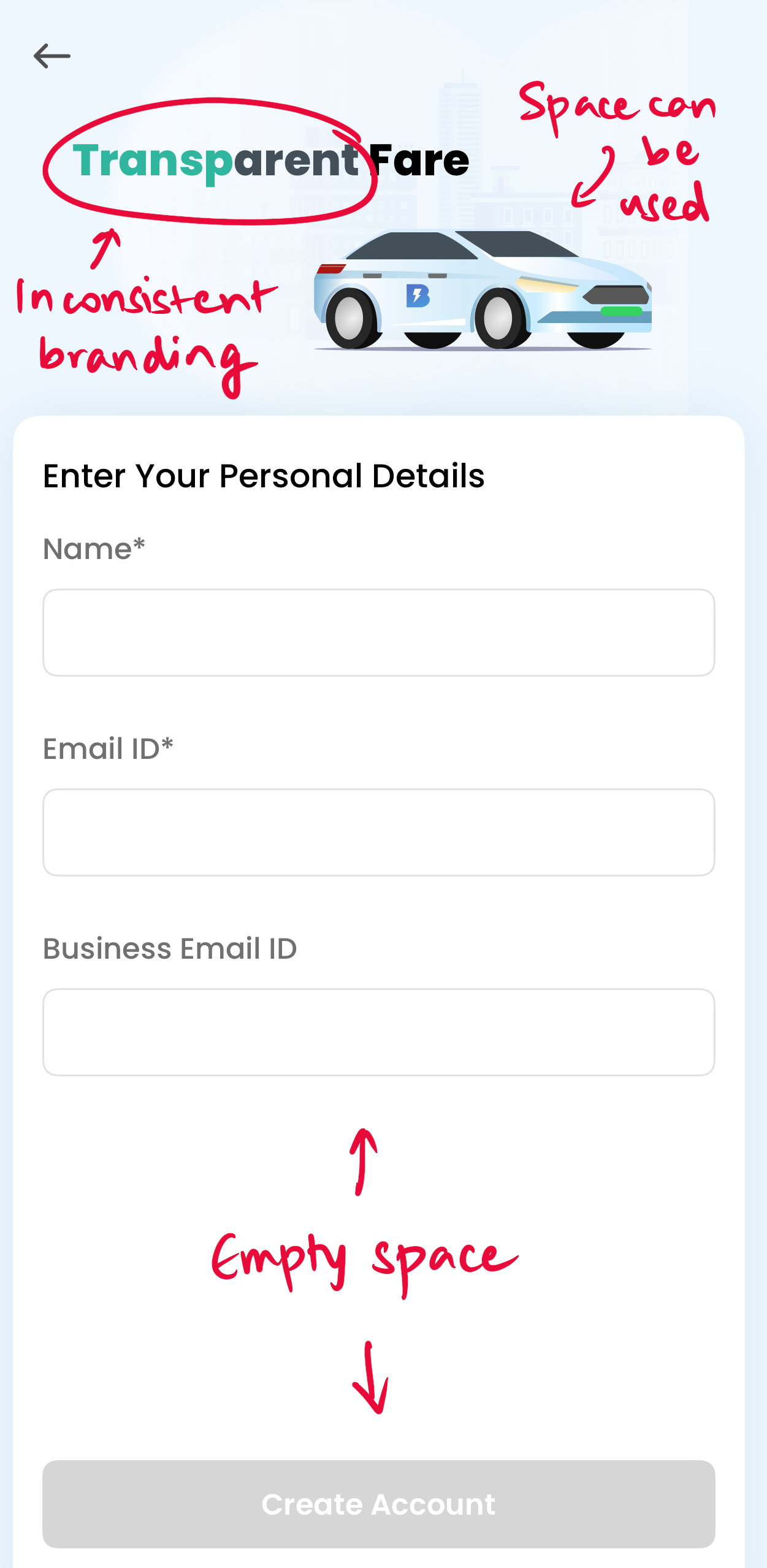
What's working?
✅ Clear ask for Name and Email id
What's not working?
❌ Branding colours inconsistent in font in the top half of the page.
❌ Space can be utilised for more engaging and visually appealing graphics, the car is the same as in the previous screen.
❌ Too much empty space at the bottom, and the "Create account" button is too far at the bottom.
Suggestions
💡Add more visually appealing and engaging elements in the top half, could be an animation of a BluSmart cab in motion, continued in this screen with a new value prop. Picture Superiority Effect and Storytelling Effect can be used to tell a user's journey story.
💡Bring the "Create account" button more upwards and utilise space better.
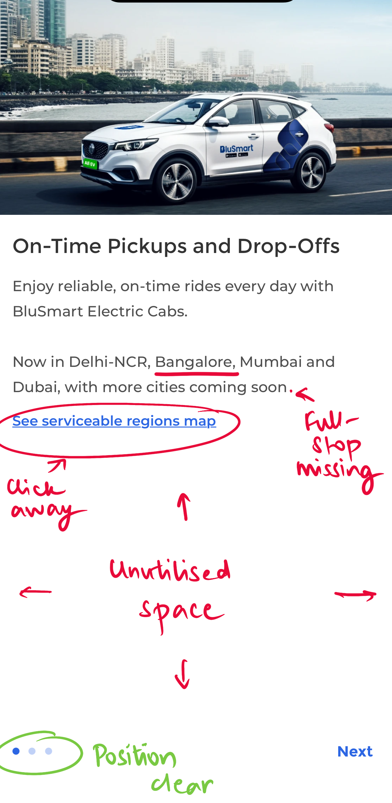
✨Aha moment: On-time pickups and drop-offs.
What's working?
✅ First picture of what a BluSmart cab looks like while on a ride, makes it more real.
✅ Position in intro screens clear with three dots at the bottom left.
✅ Consistent value pop with on-time pickups, reliable cabs.
What's not working?
❌ Grammatical inconsistencies throughout process, full-stop missing after sentence.
❌ App store graphic says "Bengaluru", this screen says Bangalore.
❌ Too much unutilised space at the bottom of the screen.
❌ Too much empty space at the bottom, can be utilised better.
❌ "See servicable regions map" link takes user away from the 1/3 screen, is an extra step.
Suggestions
💡Serviceable regions map can be teased in the bottom half of the screen
💡Bottom half space can be used to get user take on which cities BluSmart should come to next.
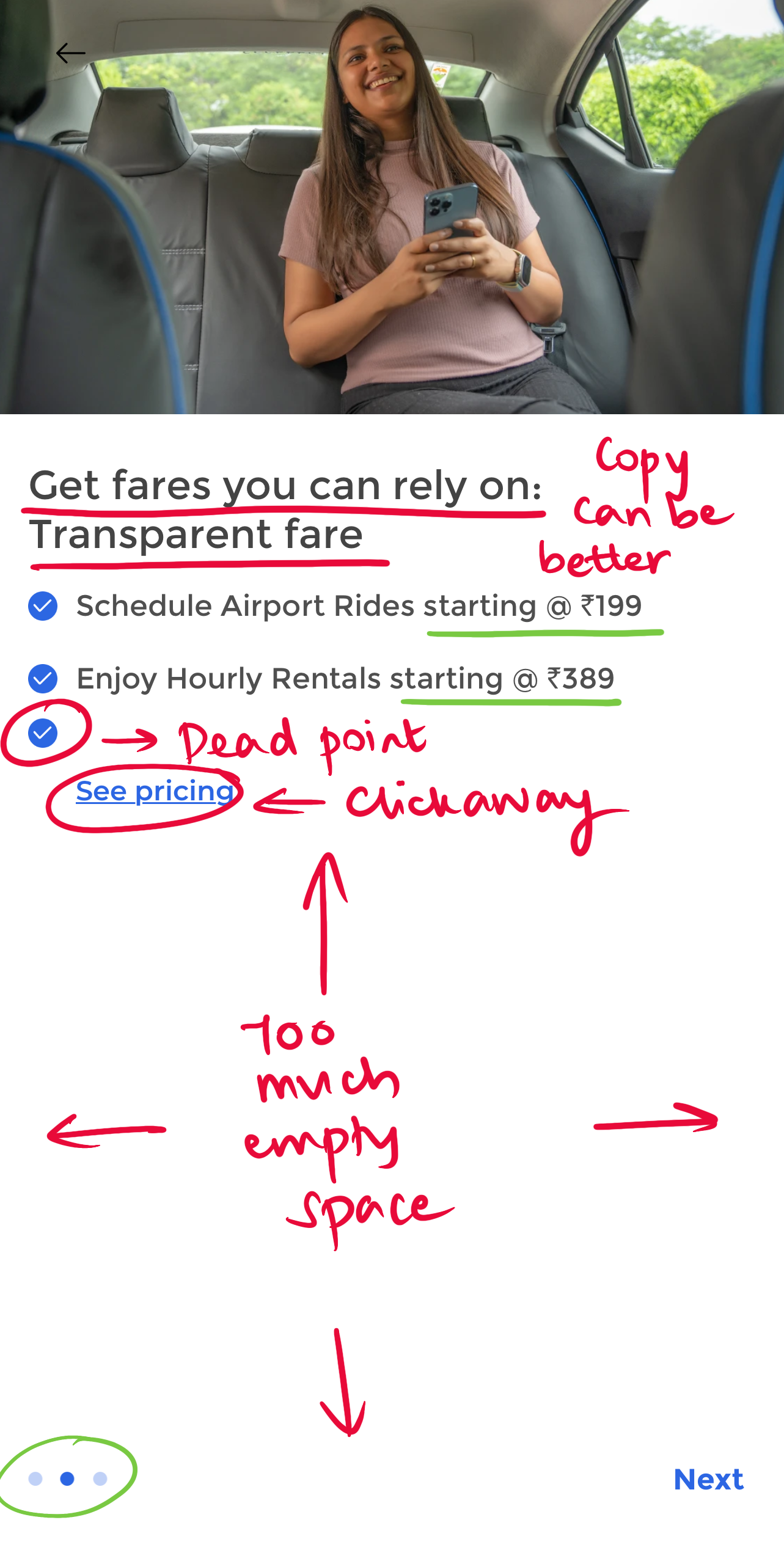
What's working?
✅ Image of happy customer builds assurance of a smooth ride.
✅ Position in intro screens clear with three dots at the bottom left.
✅ Prices starting @199 and 389 gives customer a clear idea of cost, is also
What's not working?
❌ Copy comes across as amateur, could be better written.
❌ Too much unutilised space at the bottom of the screen.
❌ Too much empty space at the bottom, can be utilised better.
❌ "See pricing" link takes user away from the 2/3 screen, is an extra step.
❌ The word "premium" missing throughout, whereas a premium feel came through as a core reason for users using the app.
Suggestions
💡Pricing or its preview can be shown in the bottom half of the screen, user can explore more if needed.
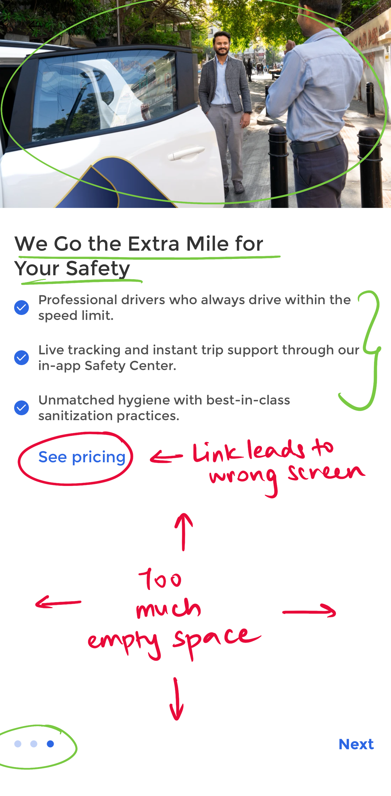
What's working?
✅ Image of professional driver greeting the user creates assurance of a smooth ride.
✅ Position in intro screens clear with three dots at the bottom left.
✅ Copy consistent with value prop of professional drivers and safe rides.
✅ Safety practices written in detailed, setting clear expectations of professional behaviour even a the user's end.
What's not working?
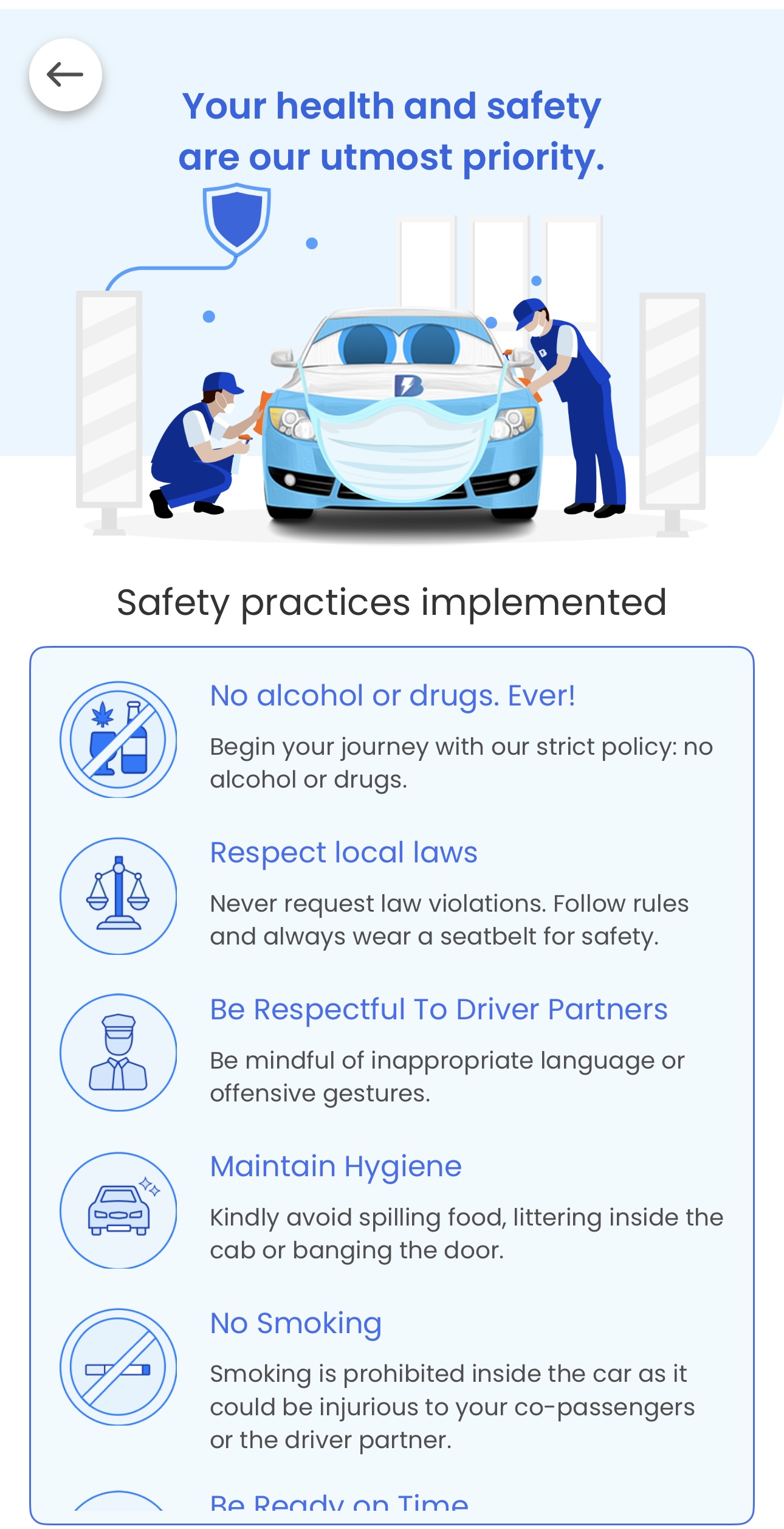
❌ "See pricing" link leads to the safety practices page.
❌ Too much empty space at the bottom, can be utilised better, maybe to show a preview of the safety practices.
Suggestions
💡A preview or summary of safety practices can be shown on the bottom half of the screen, with a button for users to click to know more.
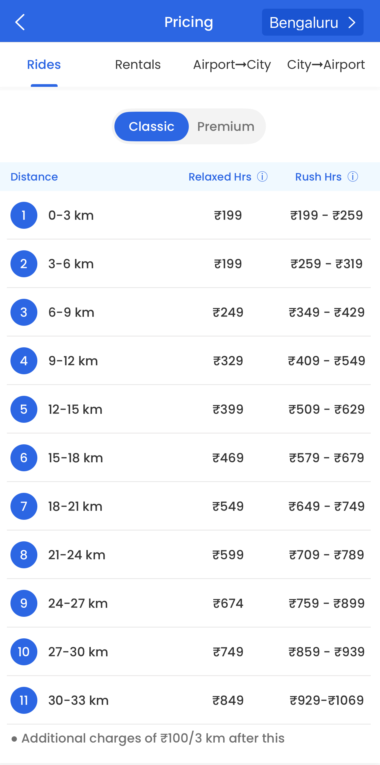
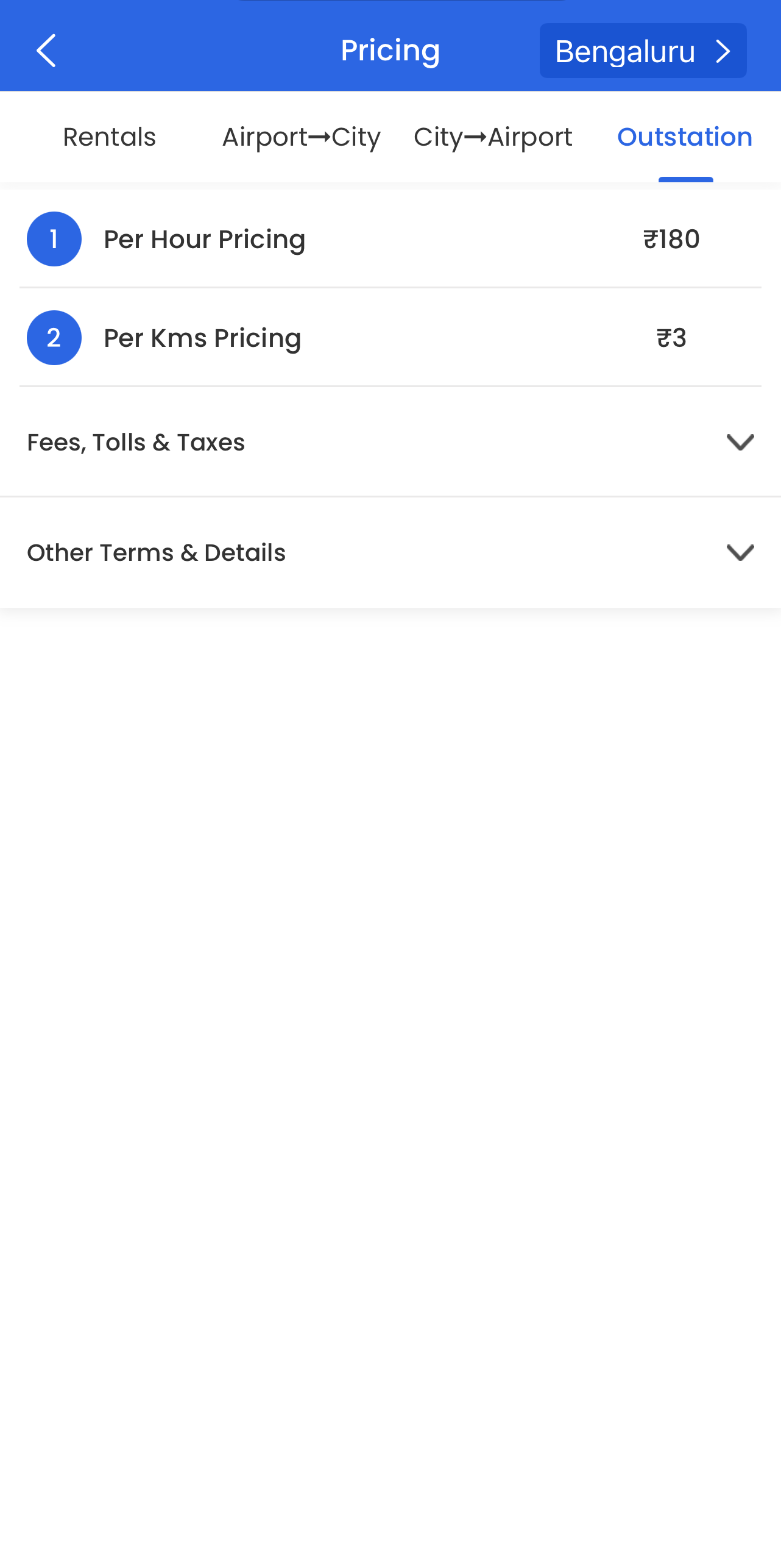
✨Aha moment: Seeing the actual transparent pricing
What's working?
✅ Clear pricing rate in alignment with "transparent pricing" messaging.
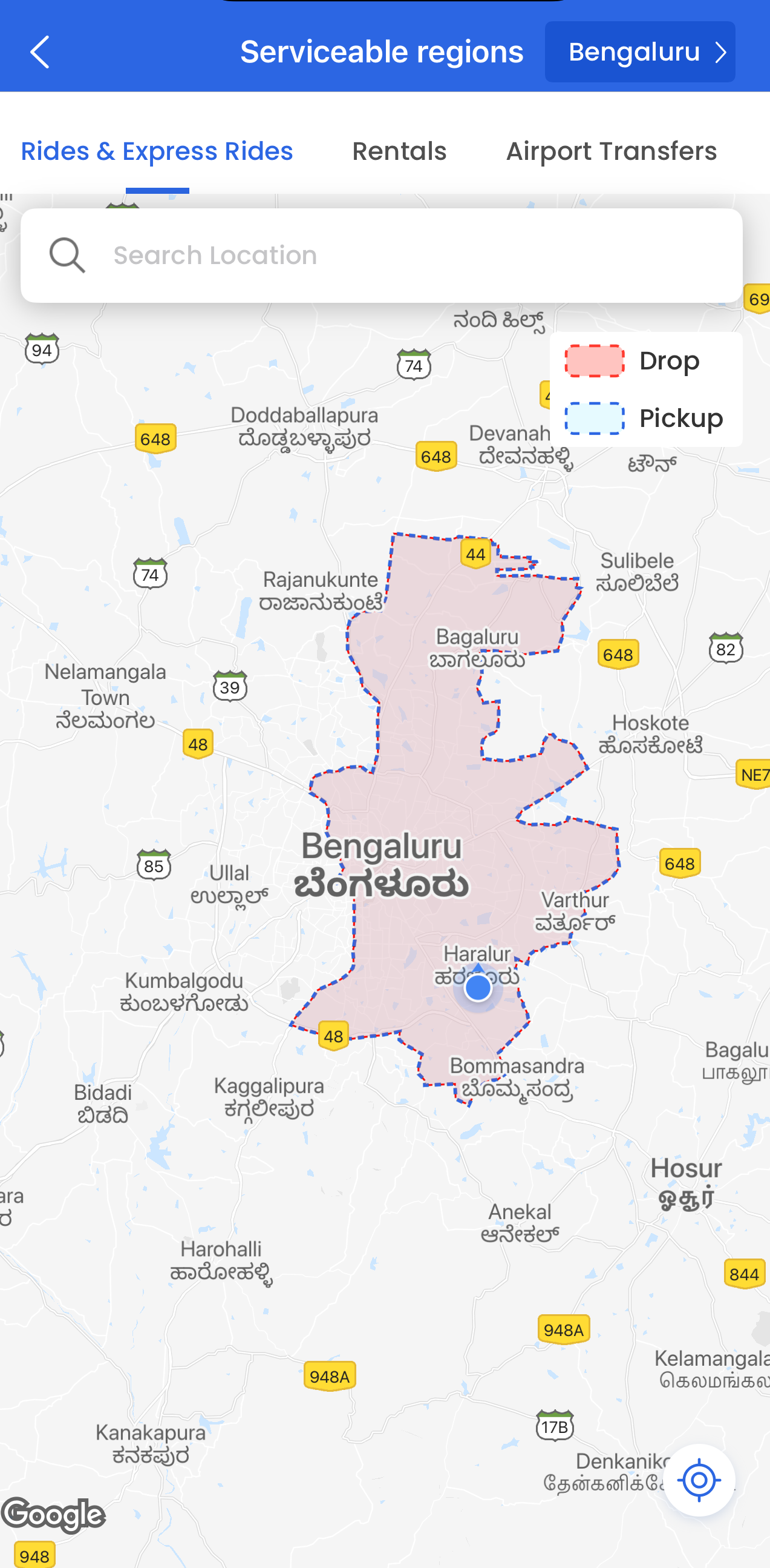
✅ Map of servicable regions gives users an idea upfront of what areas they can use the service in.
What's not working?
❌ Too much empty space in "Outstation" tab, could include engaging graphics/ animations.
Suggestions
💡Transparent pricing could be included in messaging more, also in comparison with other services.
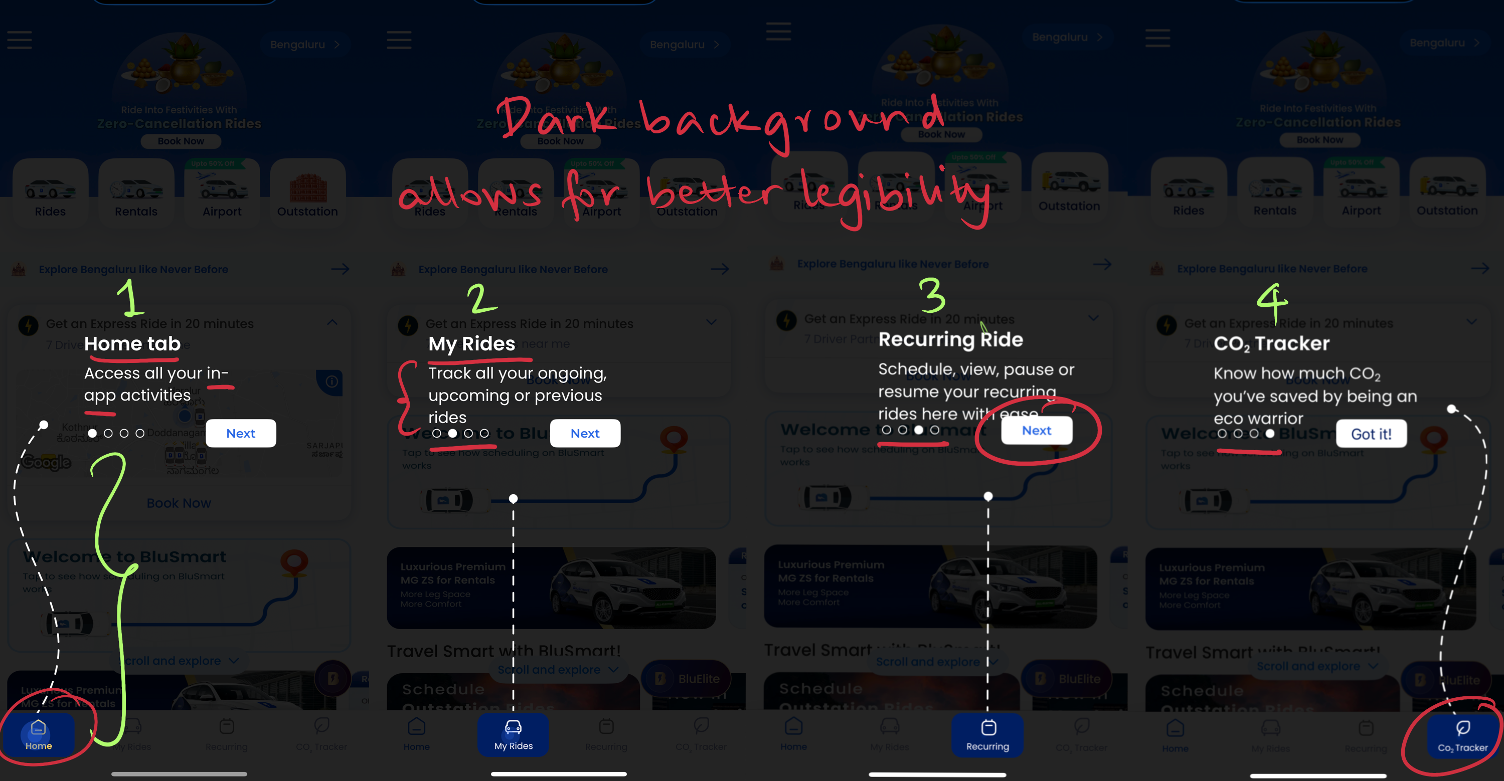
What's working?
✅ Clear explanation of the four main tabs in the app with a progressive step-by-step walkthrough.
✅ Position in walkthrough clear with three dots at the bottom left.
What's not working?
❌ Discrepancy in the capitalisation of letters in the title.
❌ Design discrepancies in the highlighted blue tab at the bottom, as well as between the text and the three dots that signal the progress in the walkthrough.
❌ "Next" tab in the 3rd screen overlapping the text.
❌ No option to add favourite addresses to ease the process of booking.
Suggestions
💡Design improvements needed in the description, placement of buttons, and the highlighted blue tabs at the bottom.
💡Add a step to add "Home" and "Work" addresses to enable easy booking when the user is ready for the first ride.
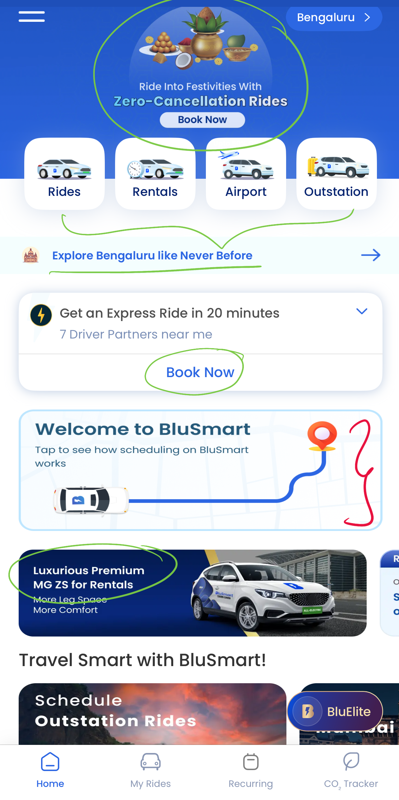
✨Aha moment: Get an Express Ride in 20 minutes
What's working?
✅ Cultural context with "Ride into festivities with zero-cancellation rides" works.
✅ Clear, up-front information about the 4 key services the platform offers.
✅ Clear CTA to nudge users to take the first action: Get an express ride in 20 minutes.
✅ Second mention of keyword "premium".
✅ Hyperlocal CTA: Explore Bengaluru like never before.
What's not working?
❌ Page looks very cluttered with too much information and too many things to click on.
❌ Grammatical errors with random words capitalised.
Suggestions
💡The home page should have one job — to drive the user to book a cab, and make the process easier. Tapping into the Aesthetic-Usability Effect, this page could be made more visually appealing and smoother to use.
💡Considering Hick's Law, would be effective to keep only the top 1-2 pieces of information people need to know on this page.
✨Potential Aha moments for a BluSmart user after booking their first ride:
Brand focused courses
Great brands aren't built on clicks. They're built on trust. Craft narratives that resonate, campaigns that stand out, and brands that last.


All courses
Master every lever of growth — from acquisition to retention, data to events. Pick a course, go deep, and apply it to your business right away.


Courses
Built by Leaders From Amazon, CRED, Zepto, Hindustan Unilever, Flipkart, paytm & more


Crack a new job or a promotion with ELEVATE
Designed for mid-senior & leadership roles across growth, product, marketing, strategy & business


Learning Resources
Browse 500+ case studies, articles & resources the learning resources that you won't find on the internet.

Patience—you’re about to be impressed.